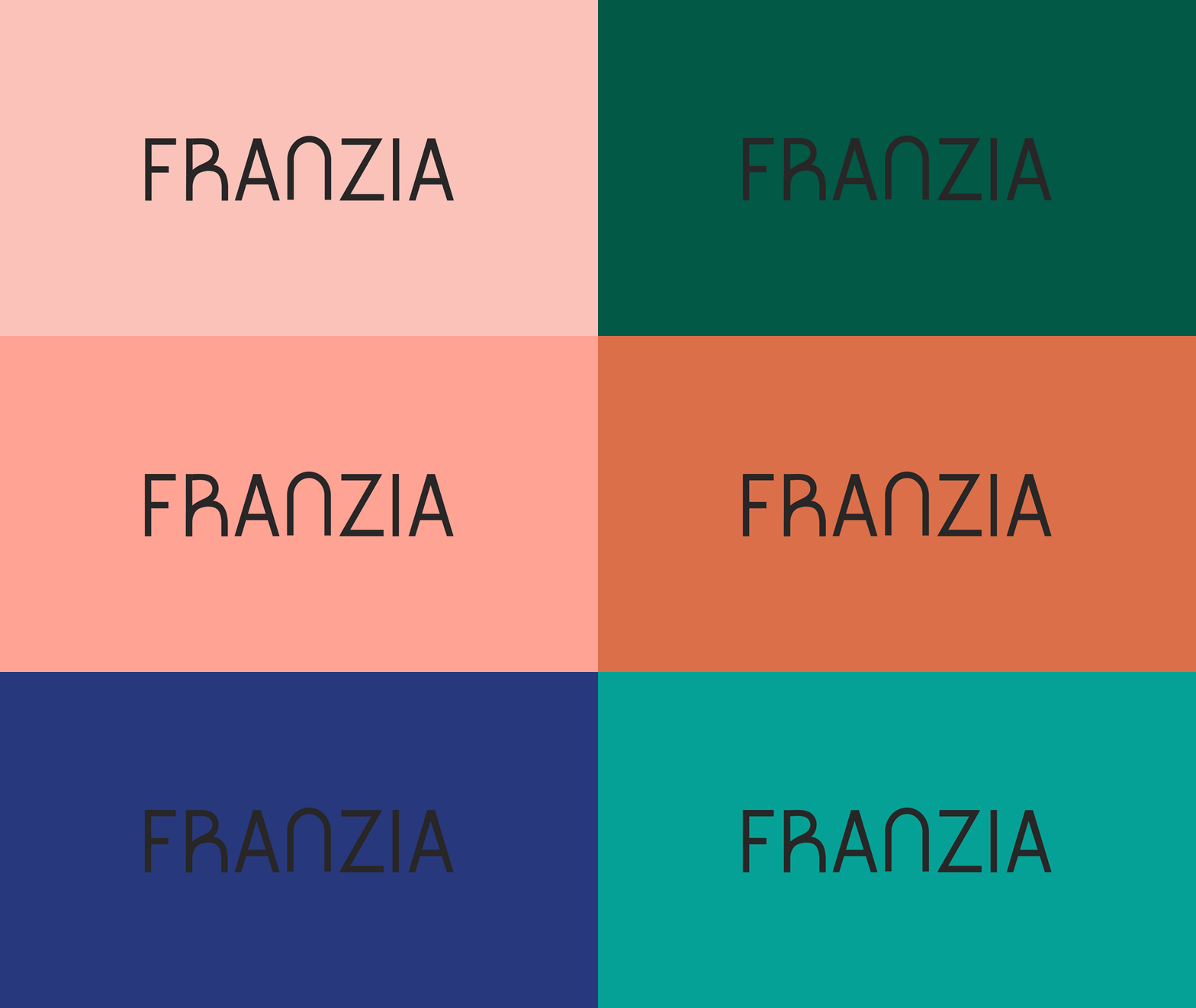
Franzia Rebrand Concept
Most people want to put Franzia in the proverbial box. It’s cheap. It’s uncool. It’s not “real wine.” Lest anyone forget that Franzia invented the box. They were the first to bring boxed wine to the world in the 1980s, and they owned that format for decades. But they no longer corner the market. Newer, prettier brands have crowded the wine aisle, pushing Franzia and its outdated packaging down to the dusty bottom shelves.
No one seems to drink Franzia publicly—but secretly, everyone buys it. It has ranked the world’s most popular wine by volume for more than 25 years and has more than 150 international wine awards to its name. The product is there. It’s the personality that’s lacking. With this rebrand, Franzia embodies a simpler, more modern aesthetic that also hearkens back to its heyday of the ‘70s and ‘80s.
Starting with a brand new logotype anchored by a curvaceous, wineglass-shaped “N”, the minimalist look lets the product speak for itself.
Sophisticated pop colors make a statement on crowded grocery store shelves.
The packaging creates a wave effect that’s impossible to ignore and fun to browse.


